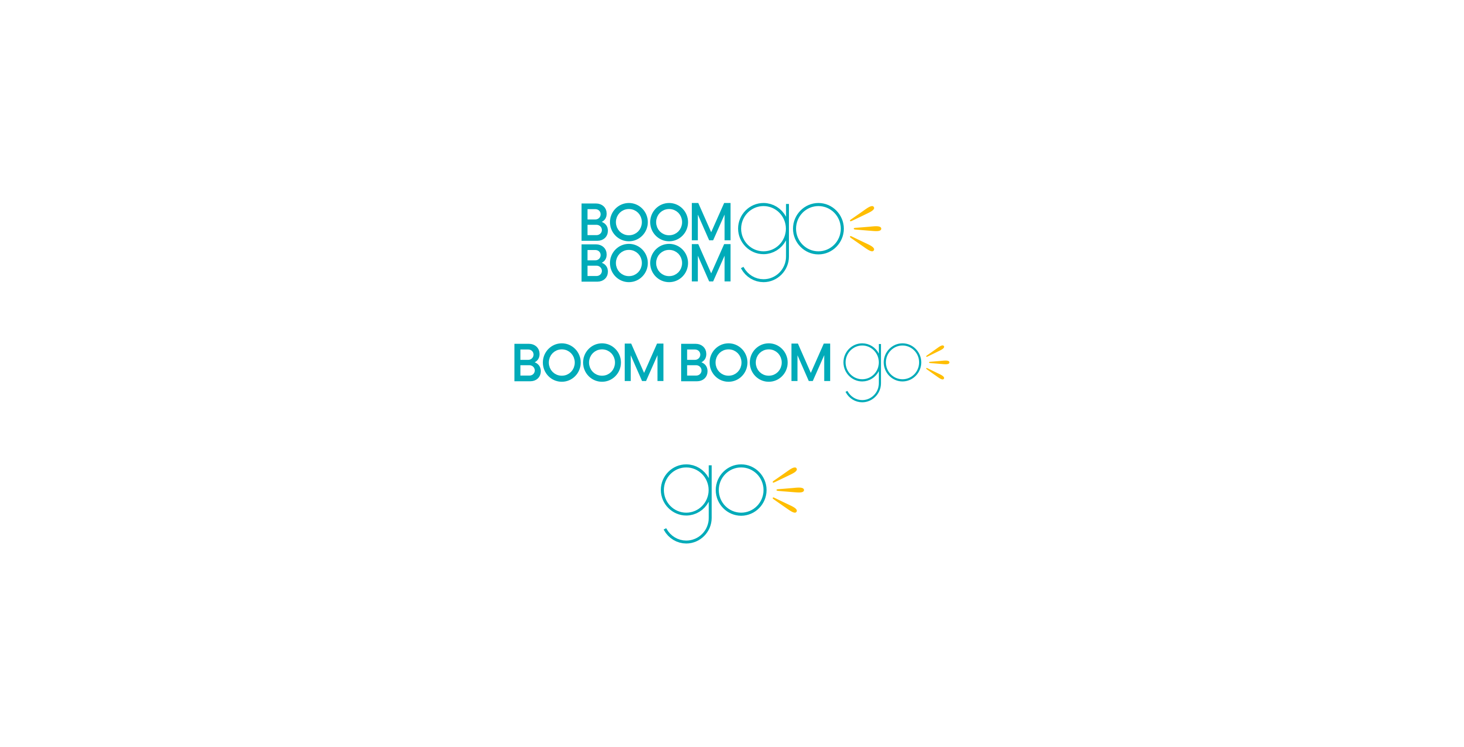
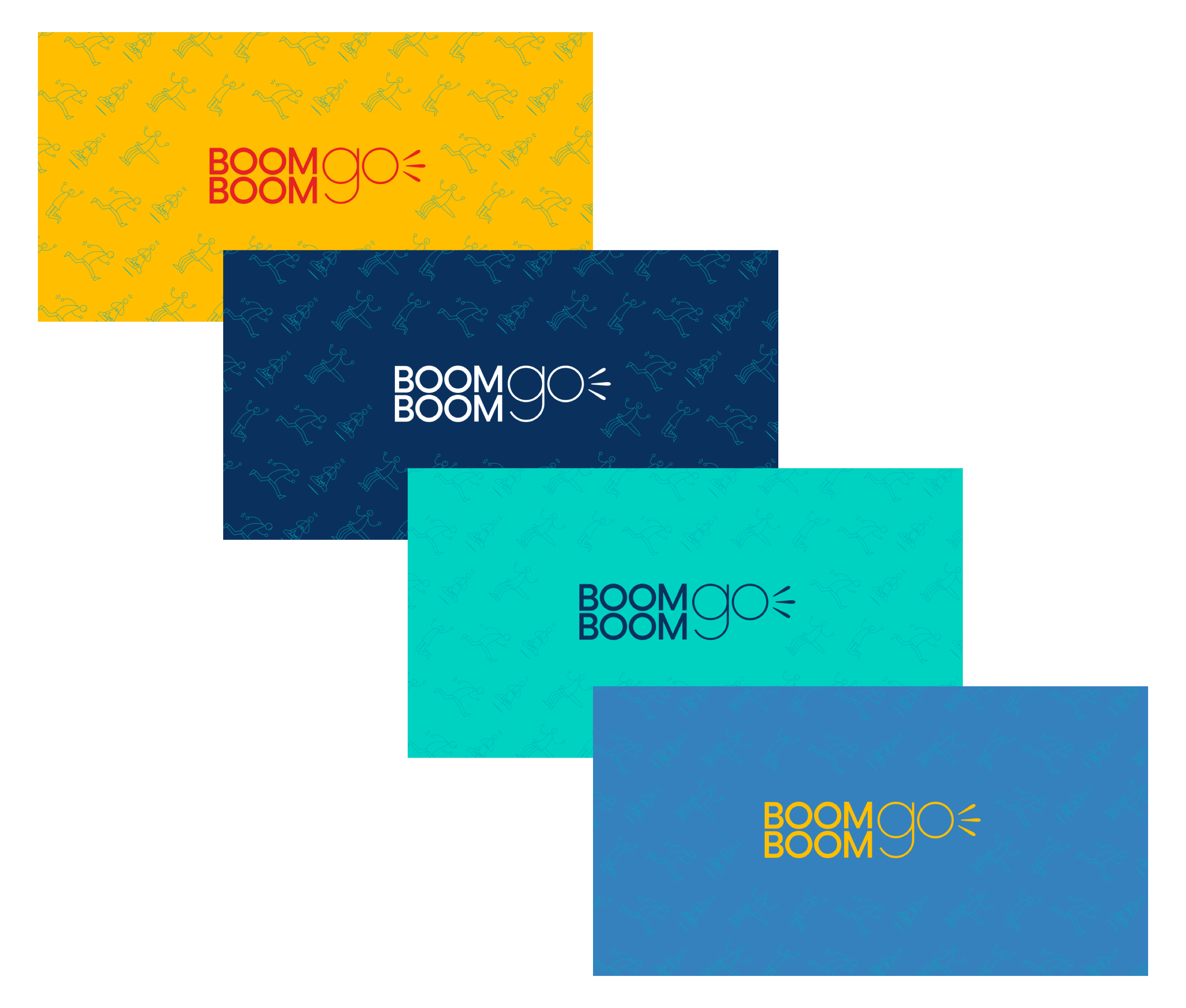
I refreshed the brand starting with designing three variations of the main logo. Primary teal and secondary yellow colours were part of a bright and positive colour palette.
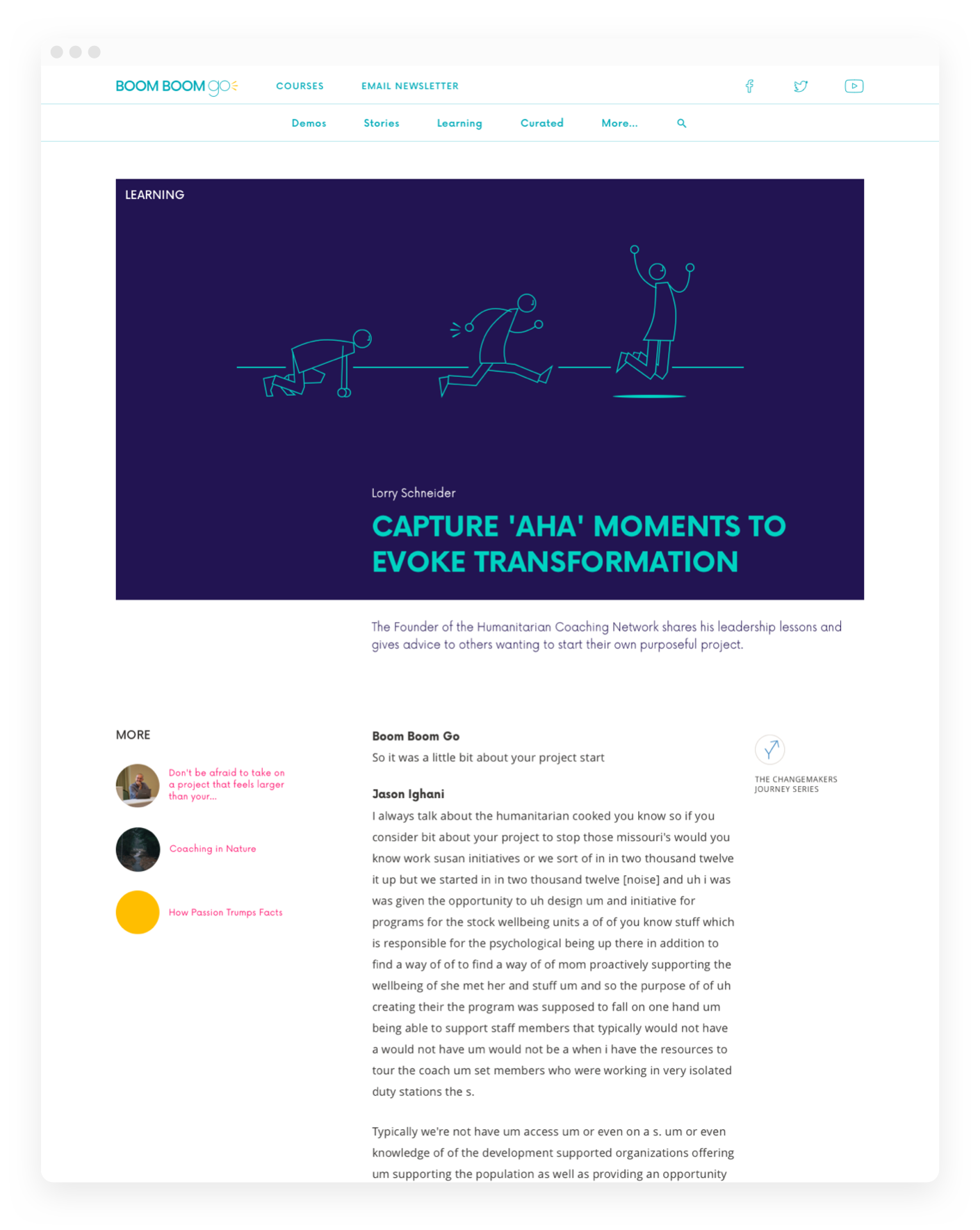
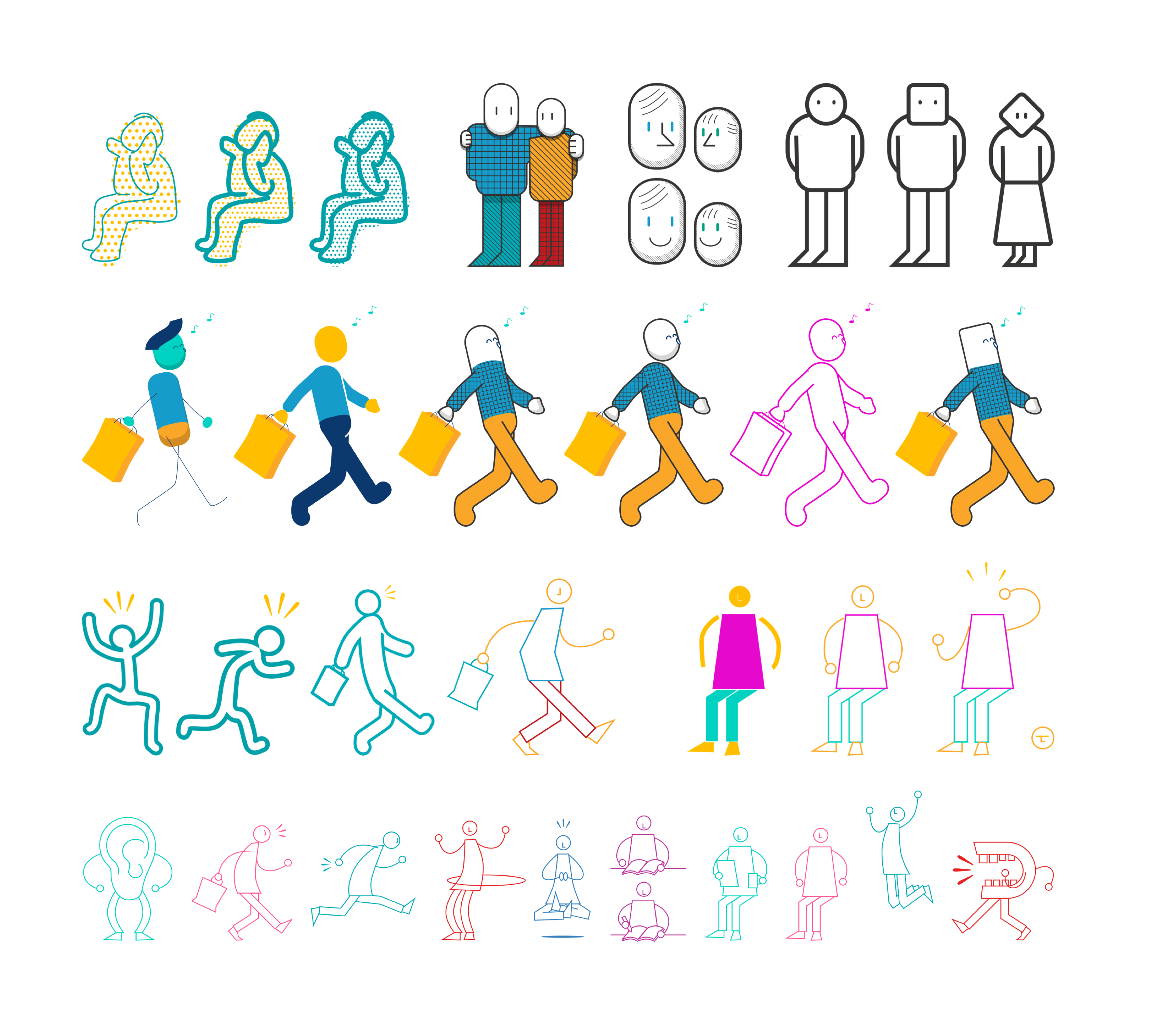
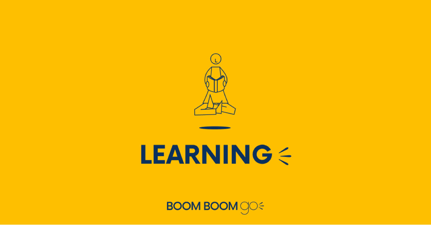
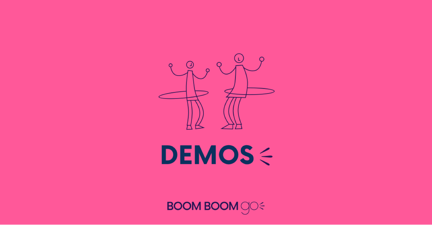
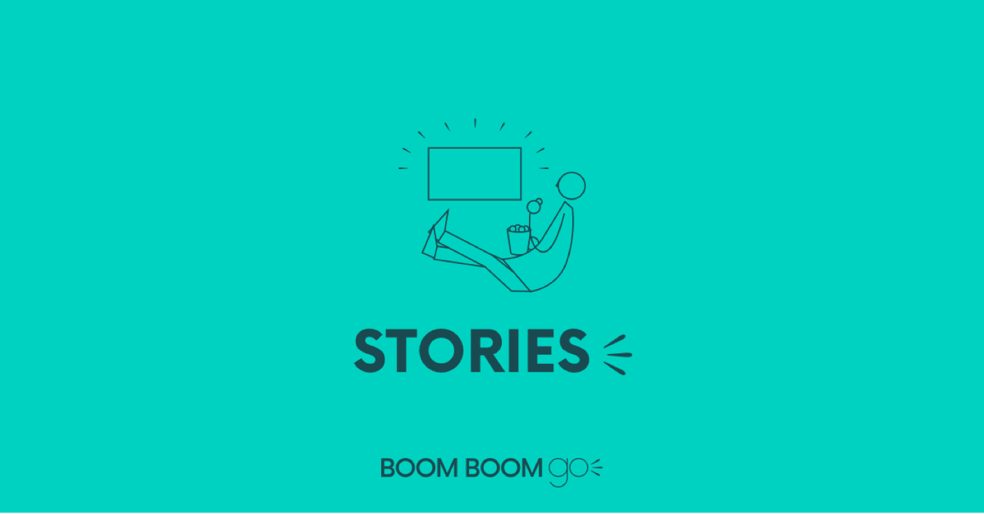
Character illustrations were used throughout the site to support courses and articles. I developed a simple but dynamic style so that new illustrations would be easily created as needed.
Courses hub
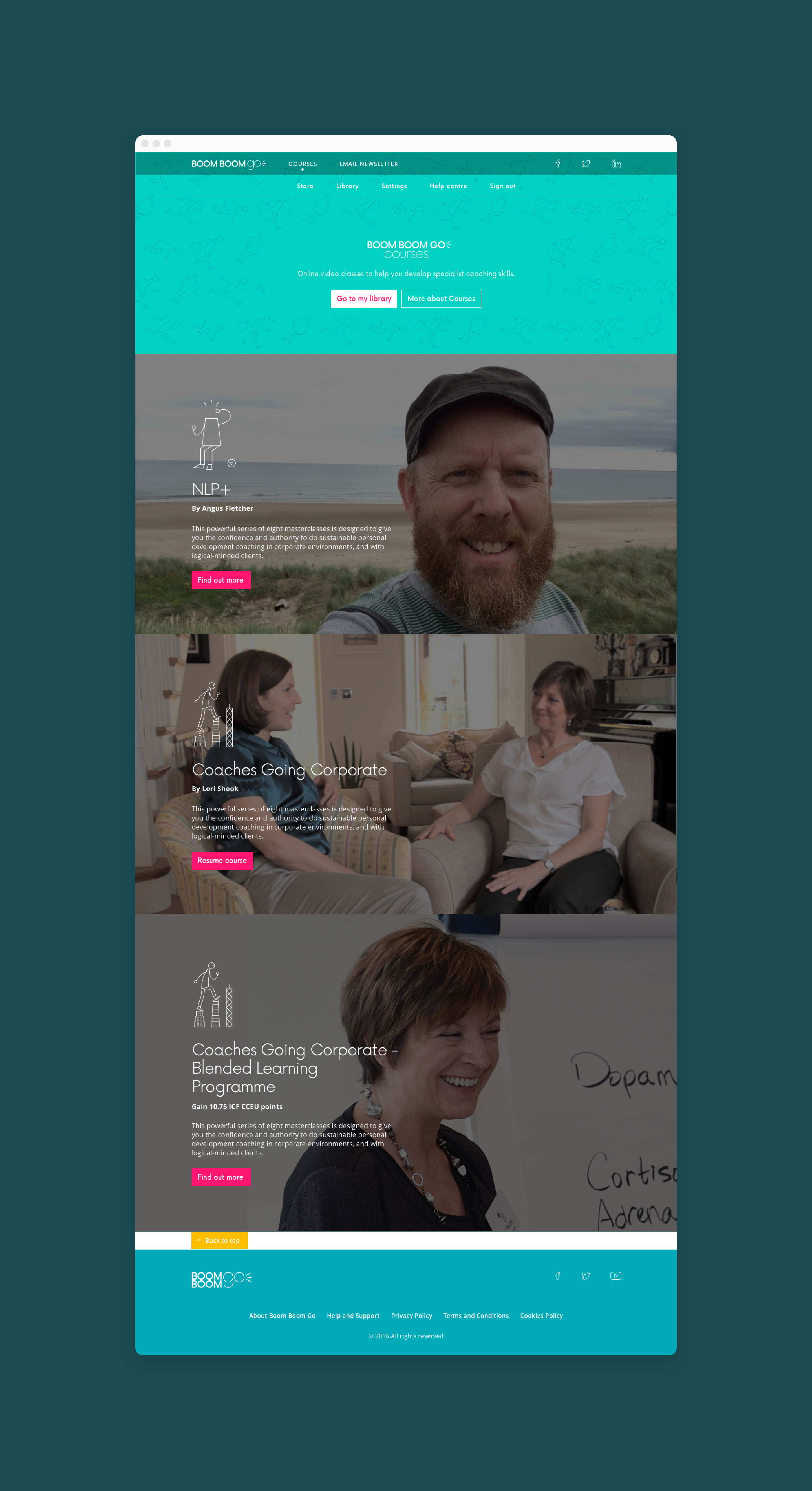
We created a sub brand for the paid courses site. The learning site itself was a redesign of the new LMS. Core pages included a homepage, course sales pages and a checkout funnel.


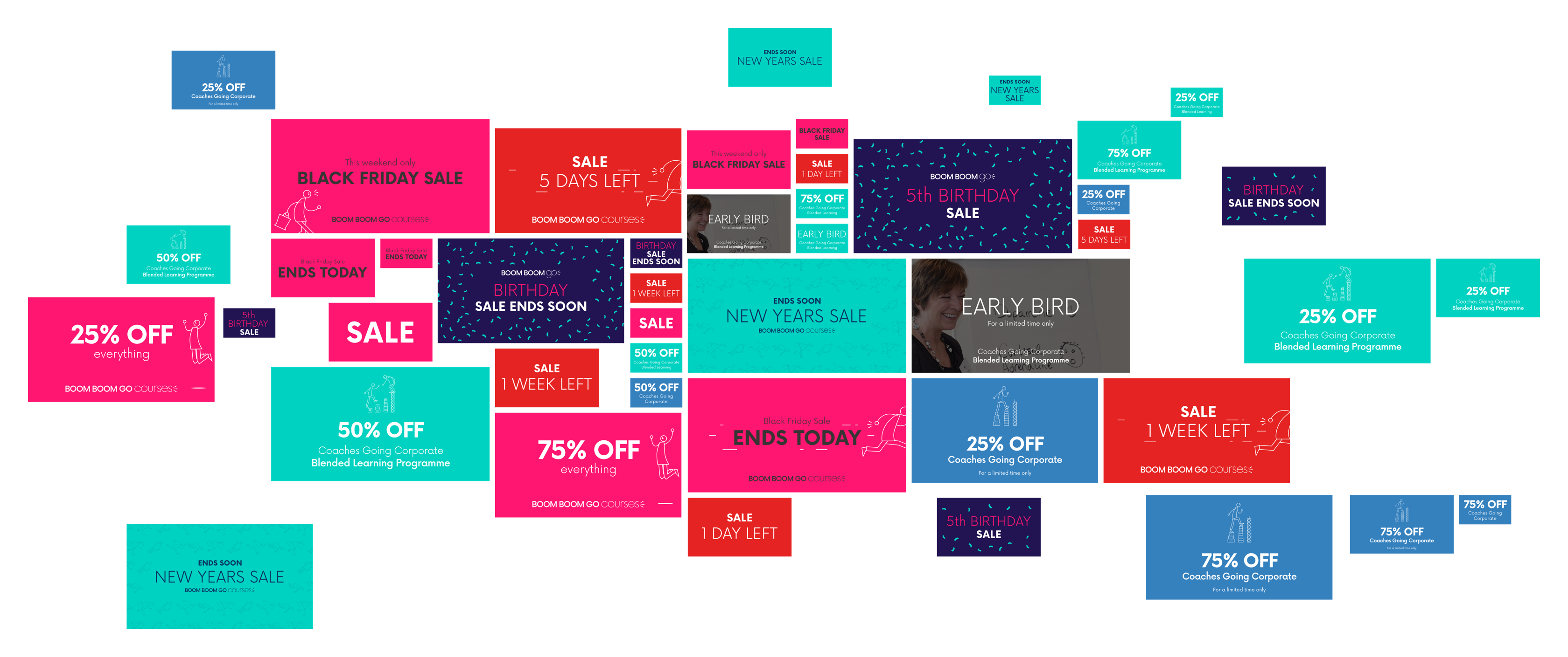
I created an extensive library of promo and sales banners for various social media platforms and marketing channels, for the client to use when needed.
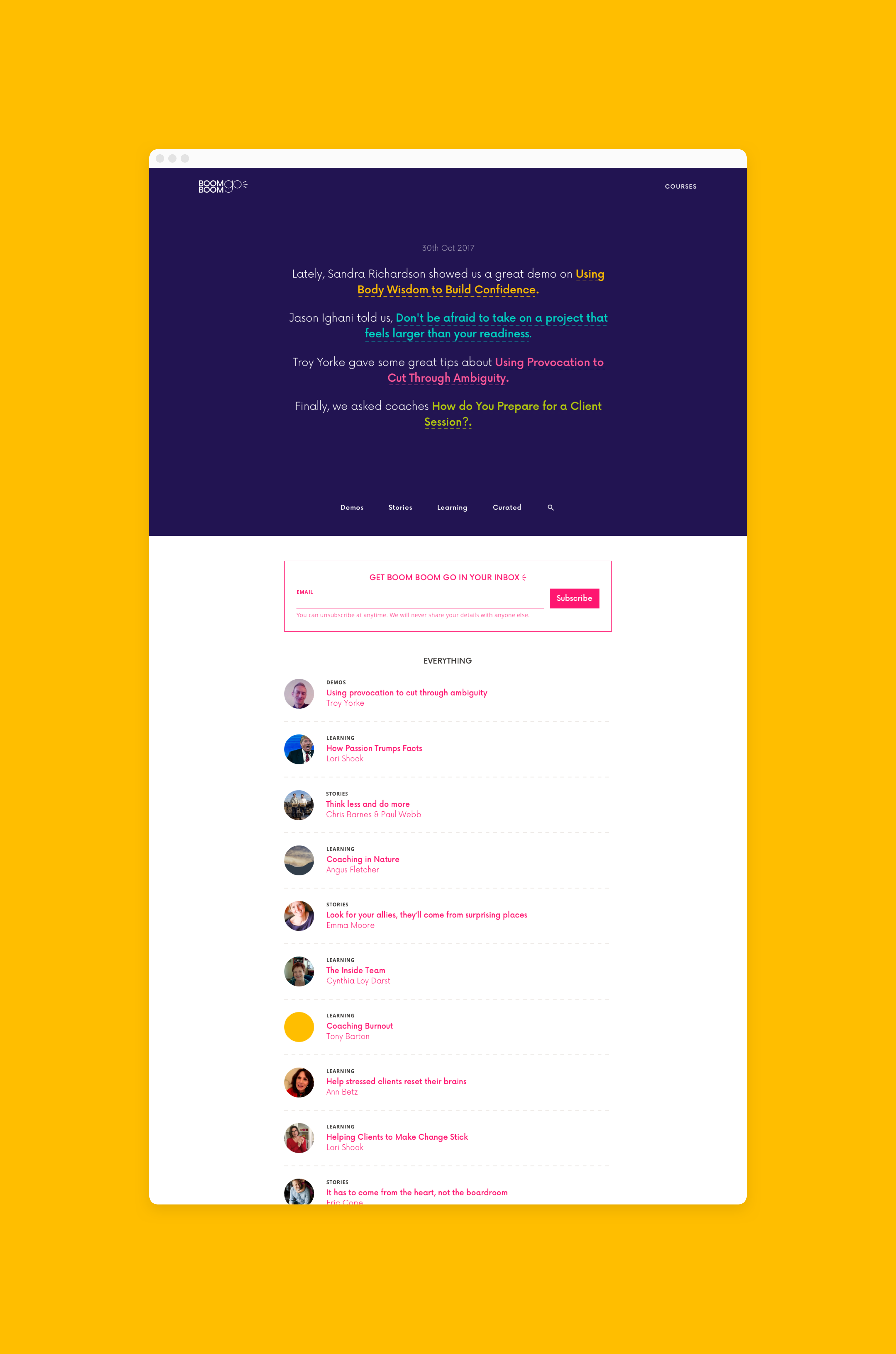
The main site contained written and video based articles used to funnel users to the courses section. Latest articles were brought to the top of the homepage and presented using randomly generated ‘chatty’ copy. On hover the copy would fade out leaving only the key information visible. Content could also be accessed from themed hub pages.
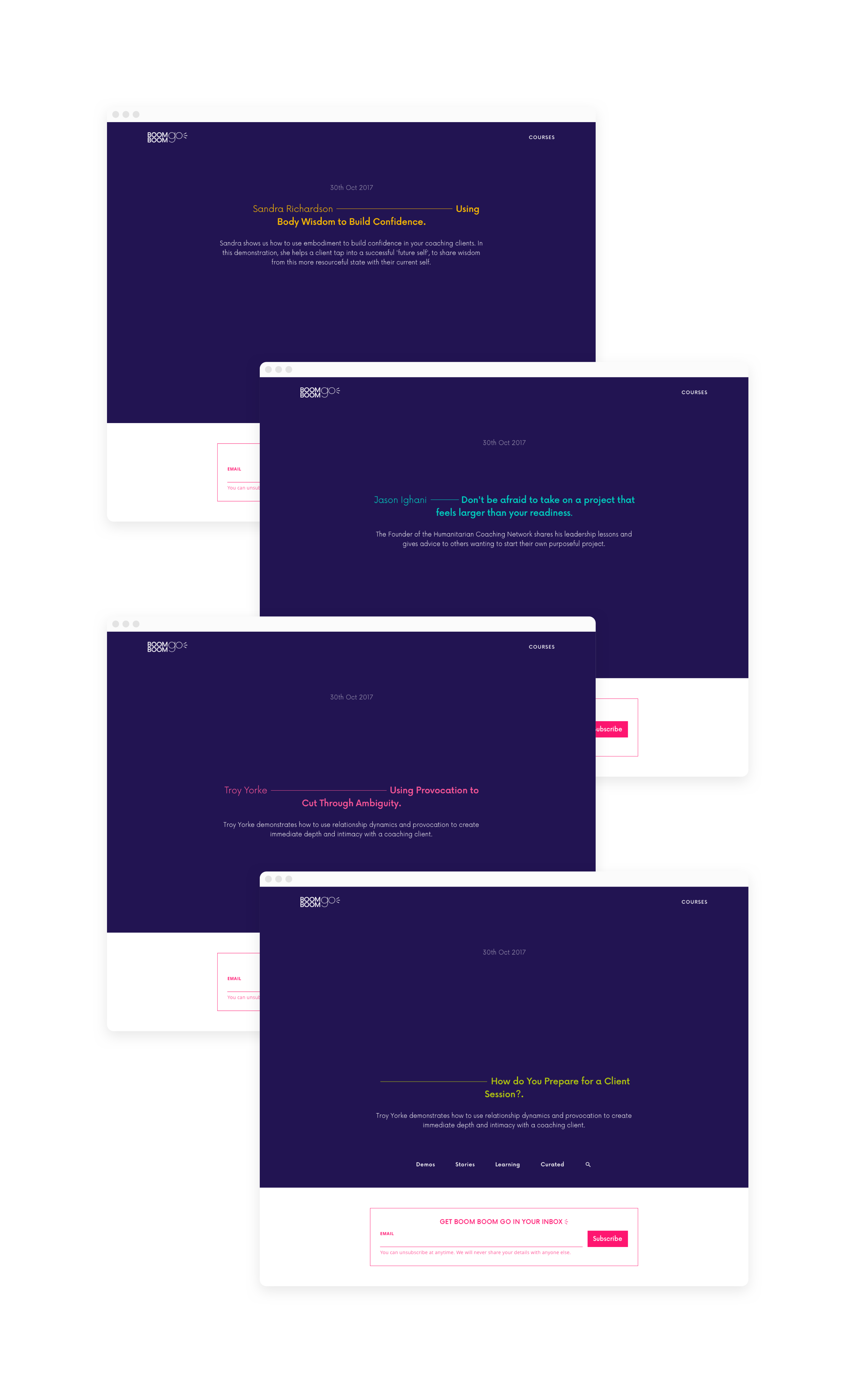
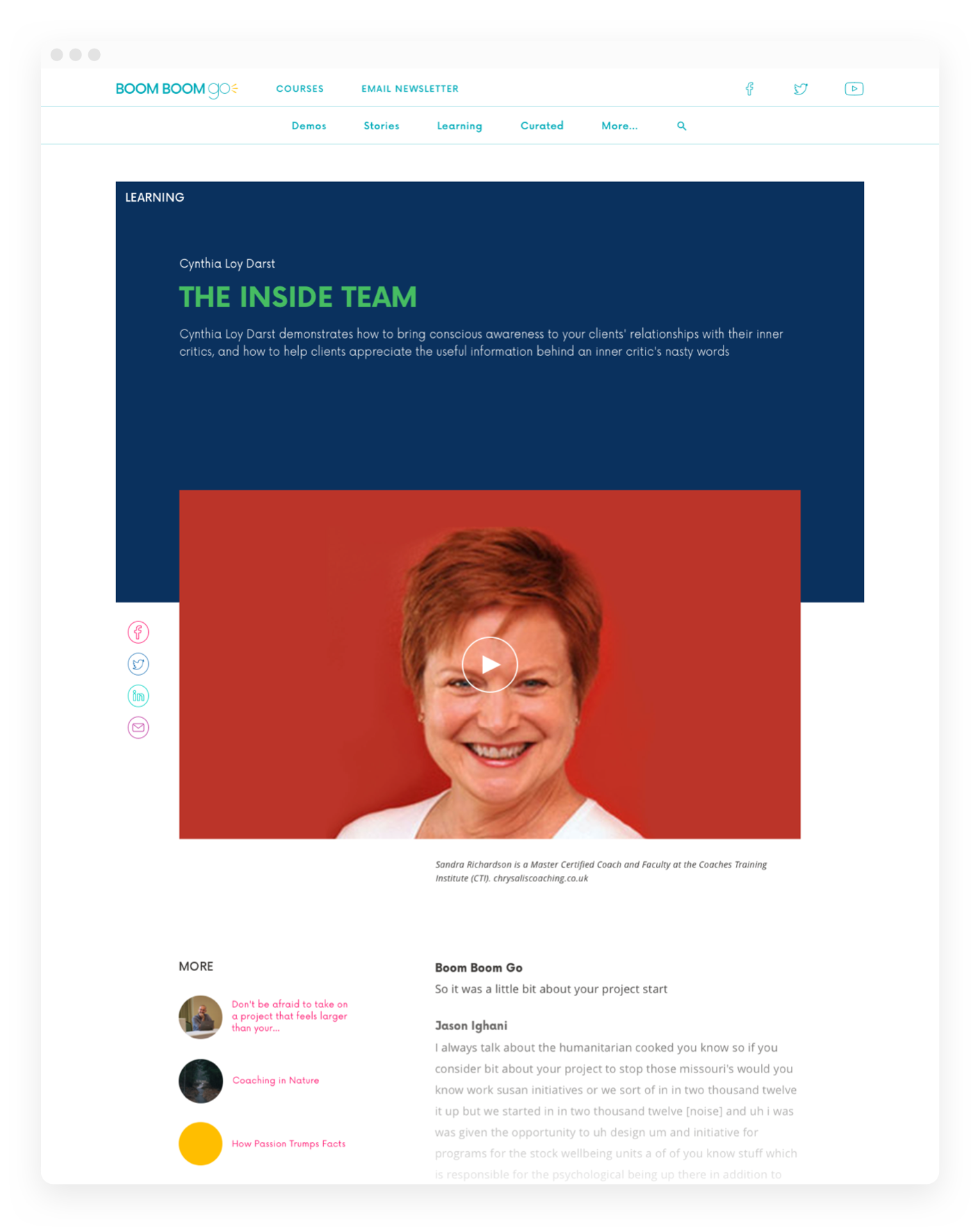
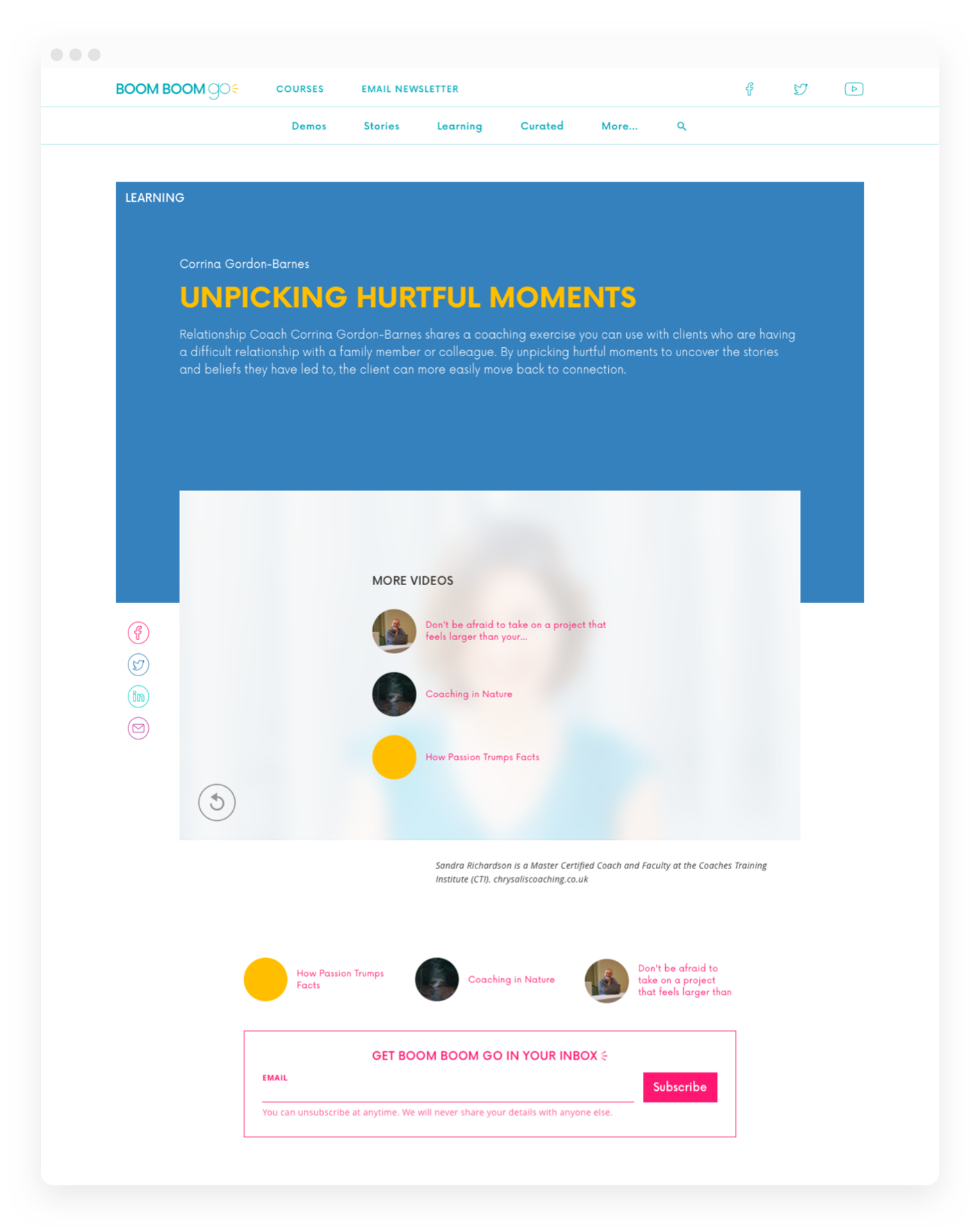
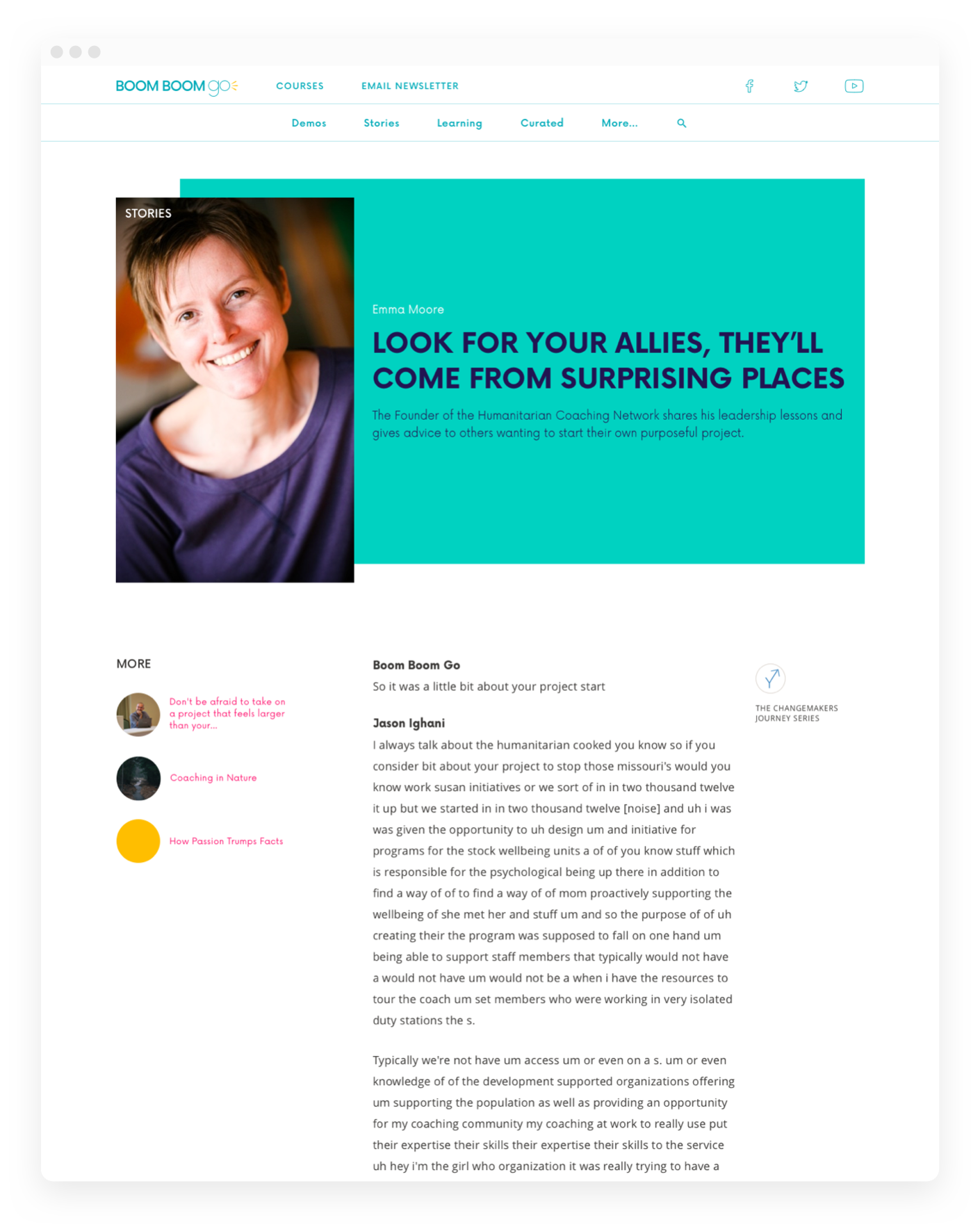
I designed three basic types of article templates: video only, video with text and text only. Variations on page headers depended on the article topic (an interview typically featured a portrait image rather than a standard horizontal image for example). Each header also had a number of colour options chosen by the author in the CMS.
