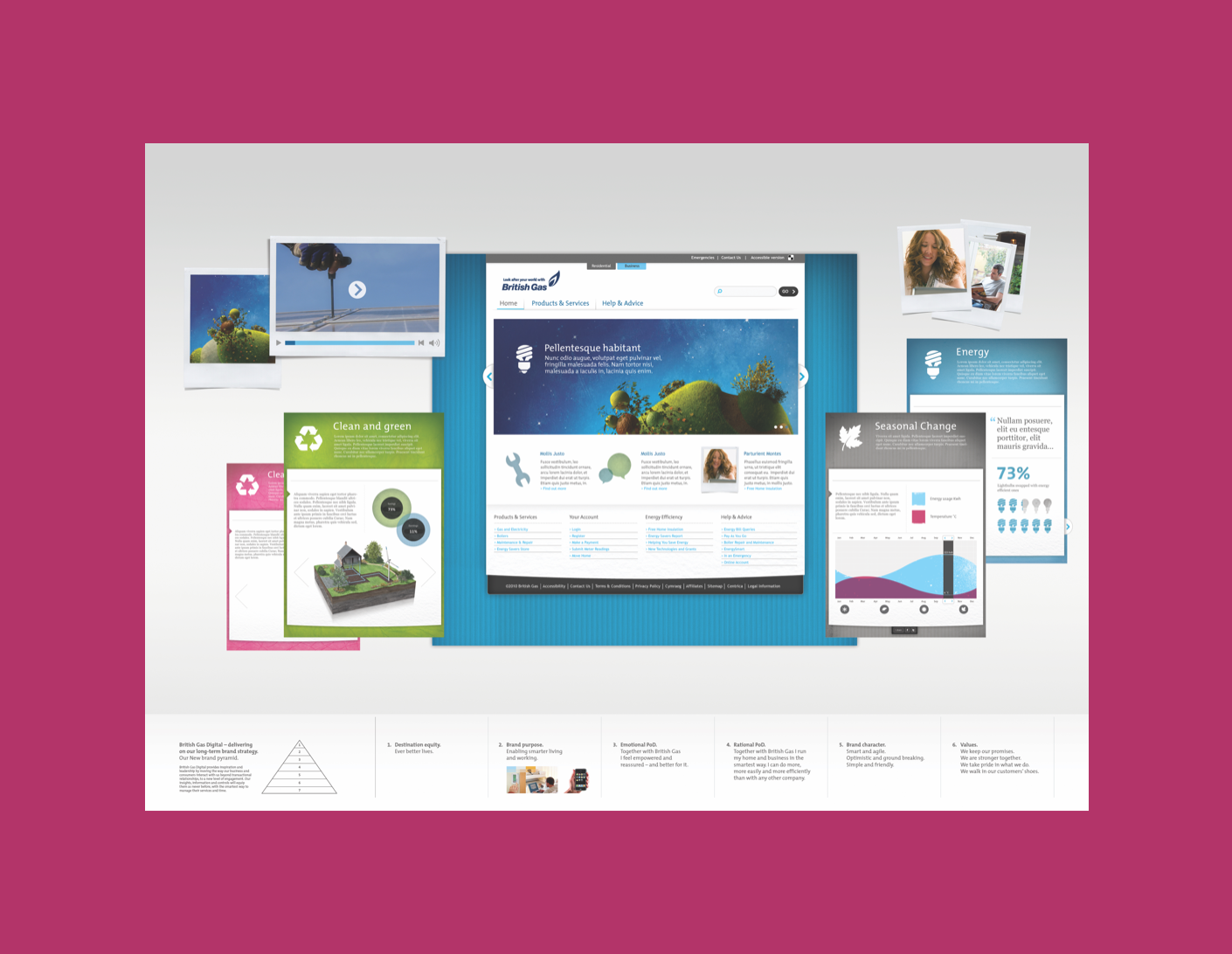
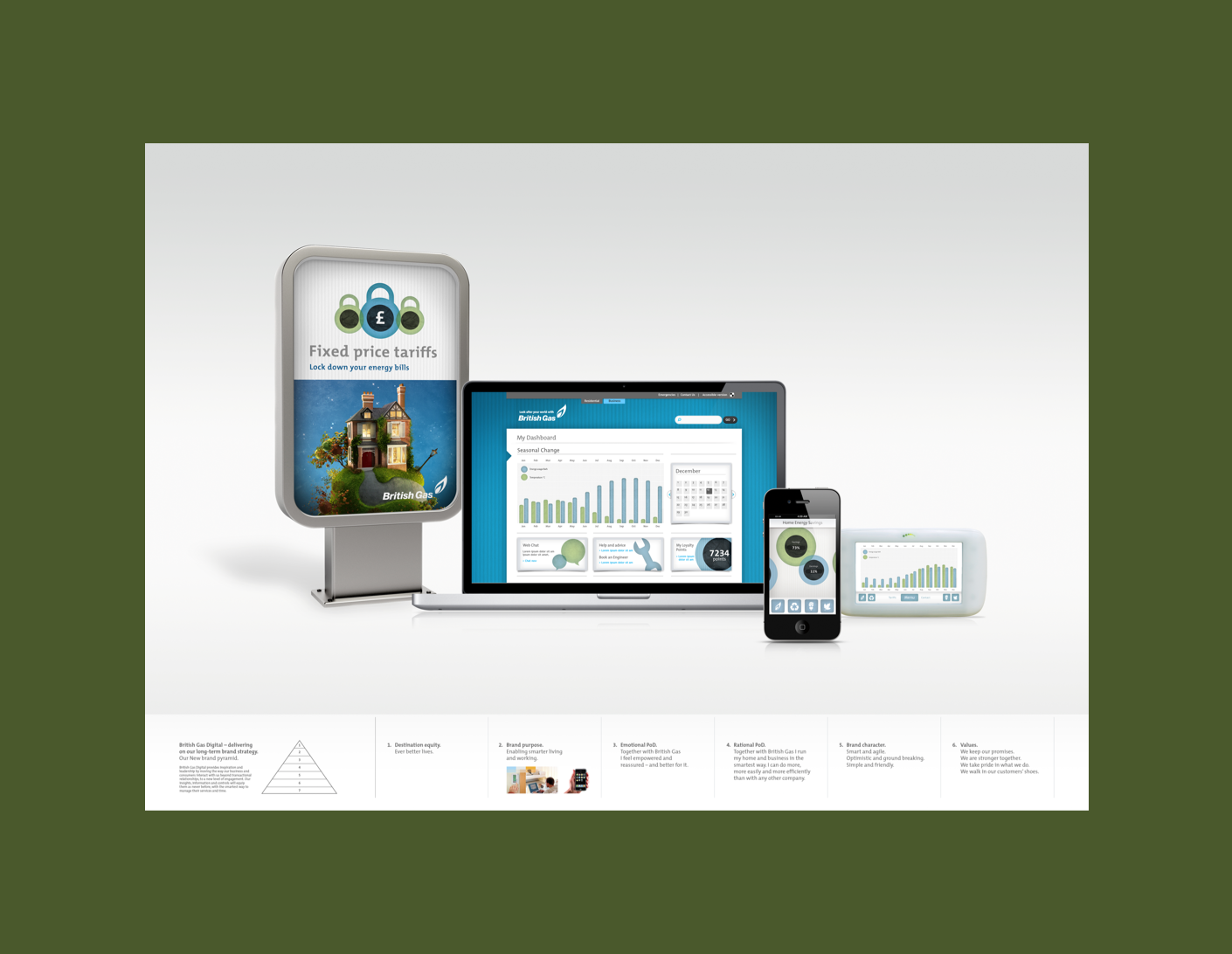
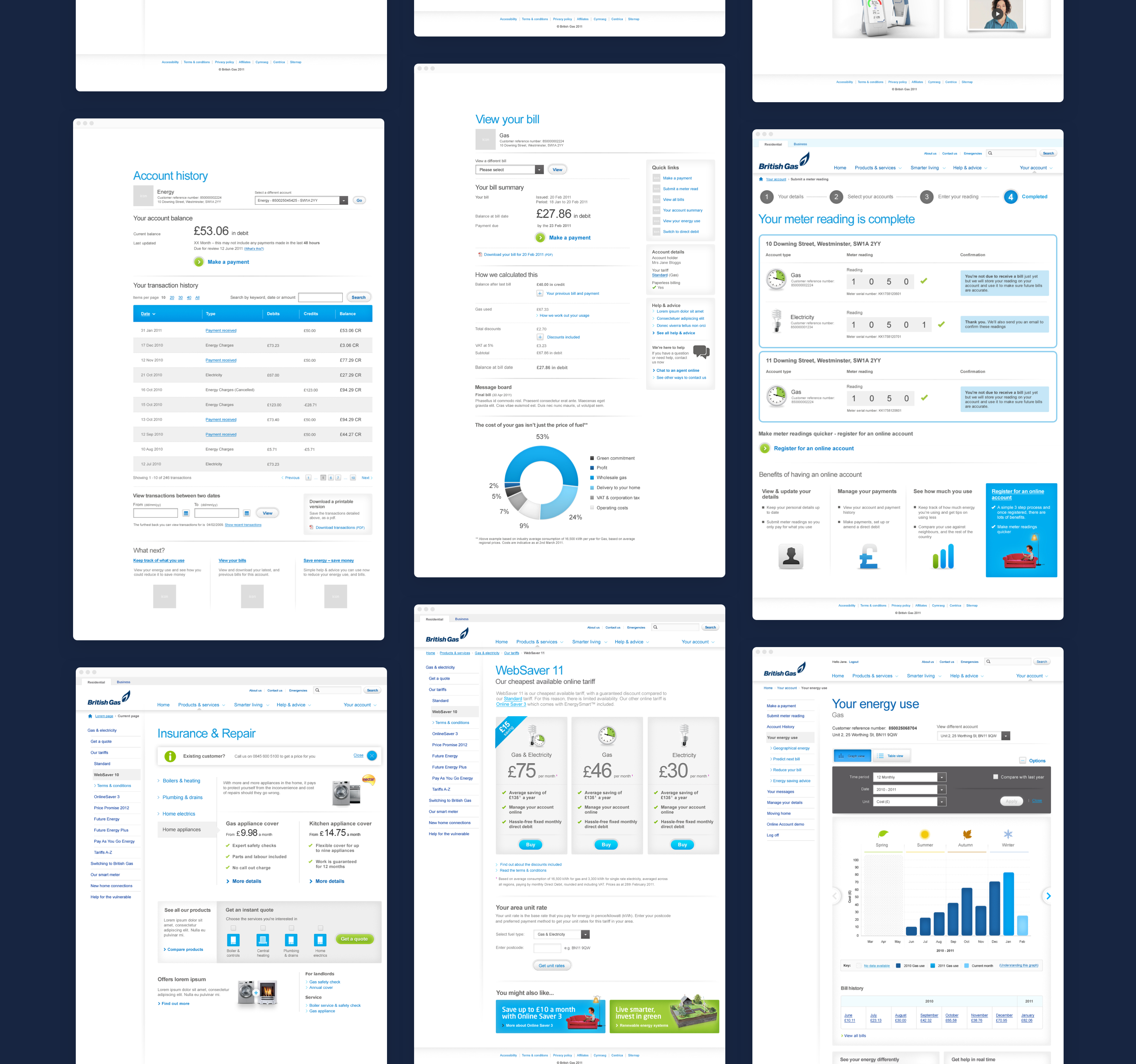
Distinct visual directions were established early on to present to the client.


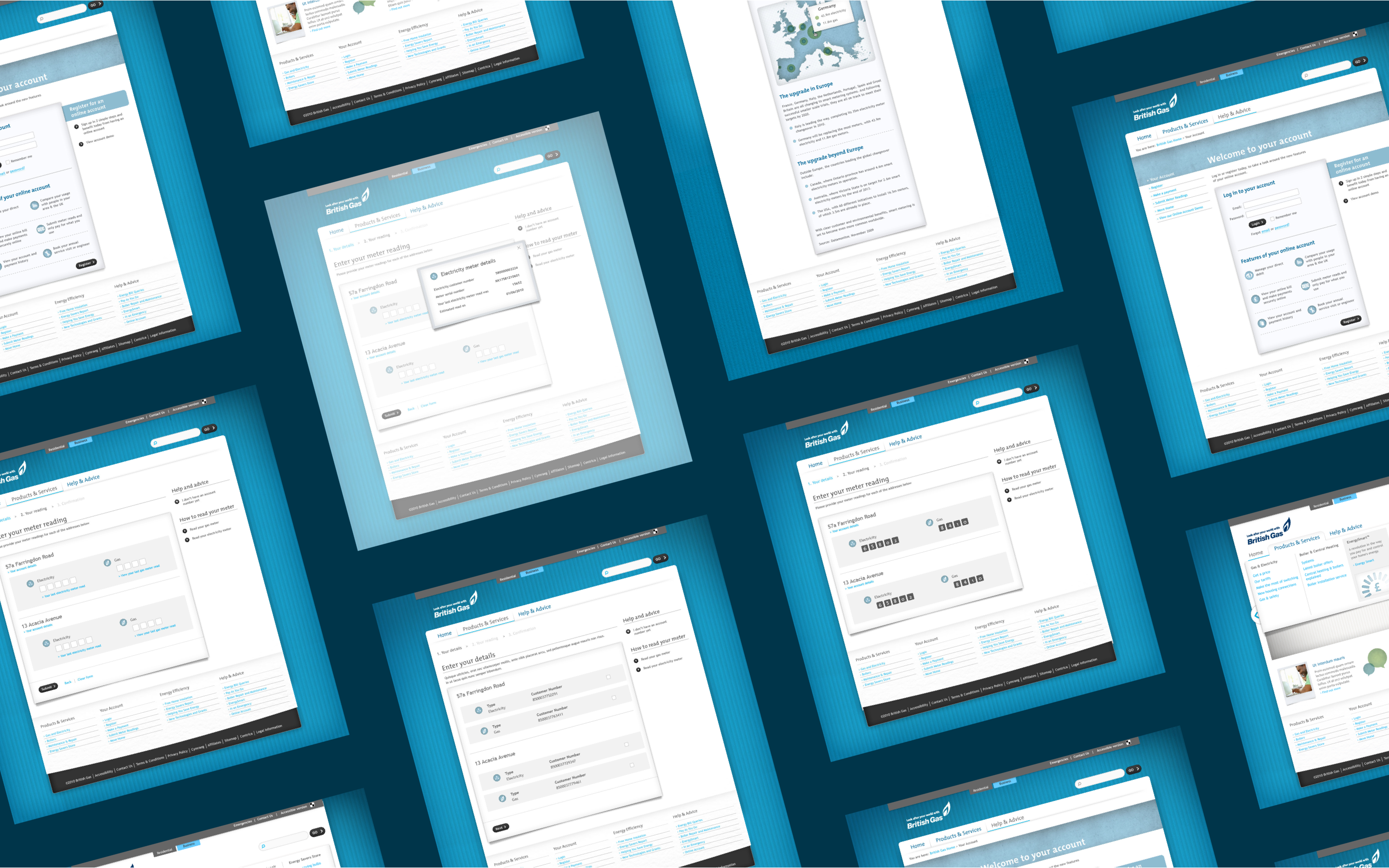
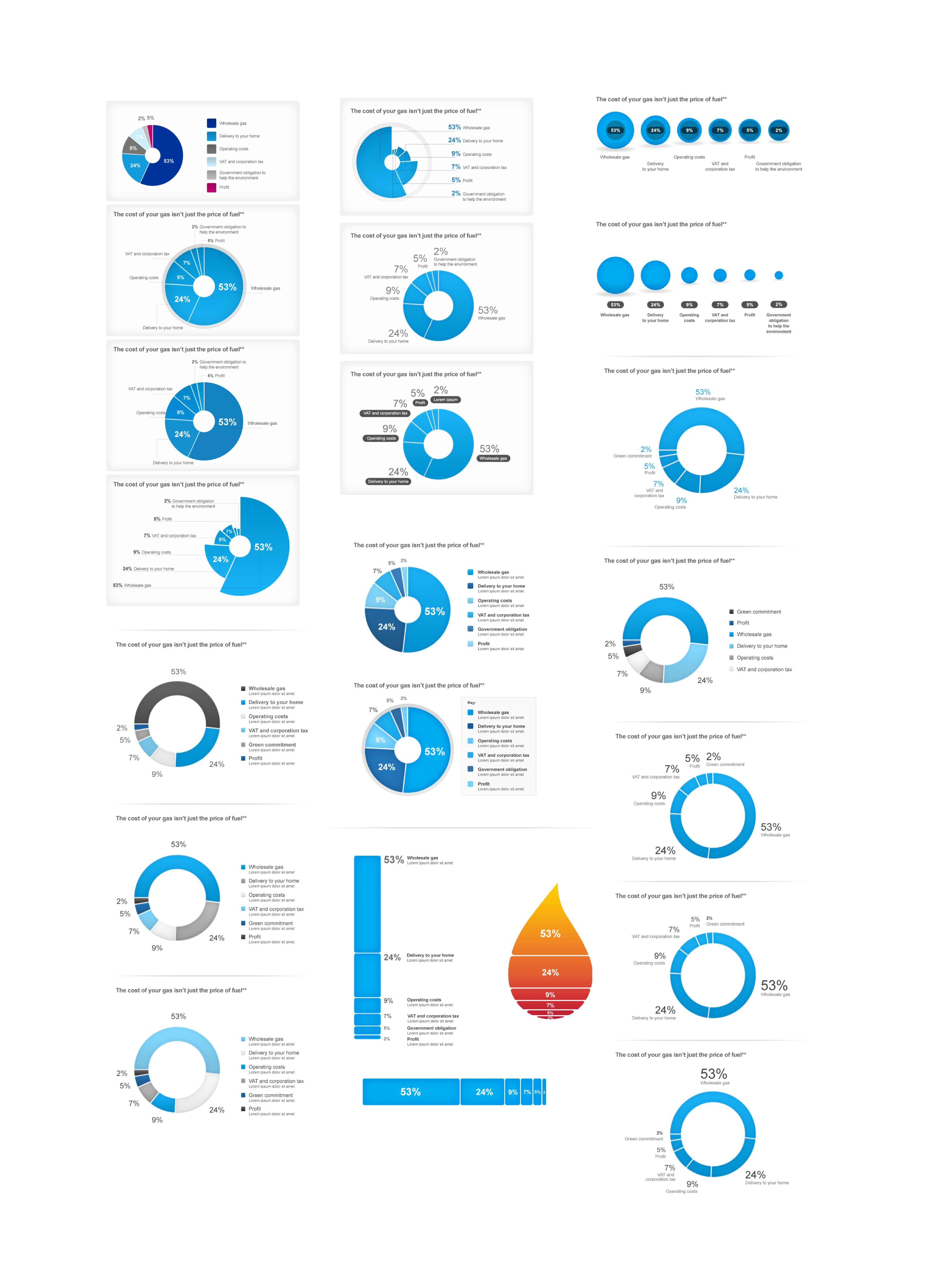
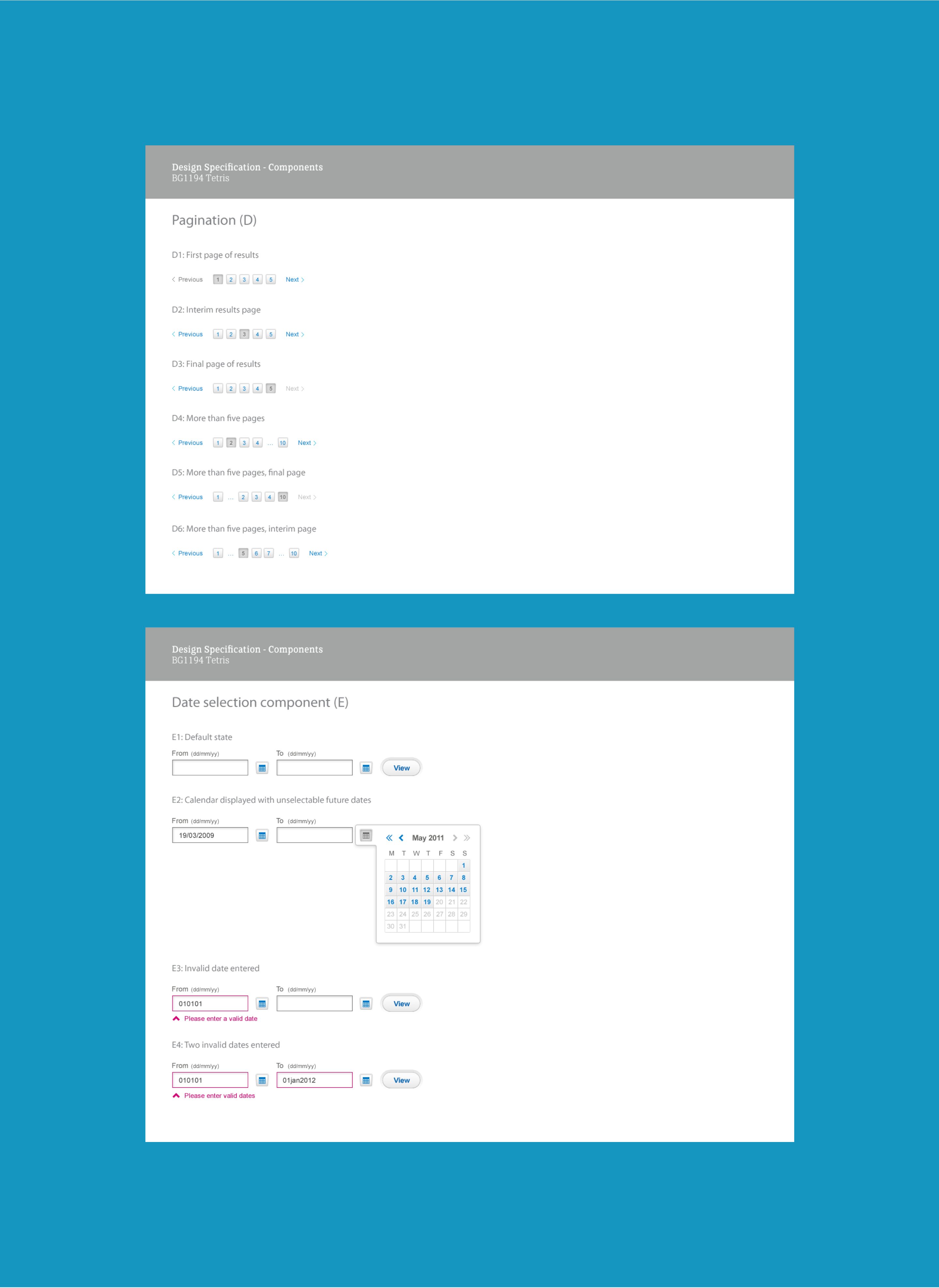
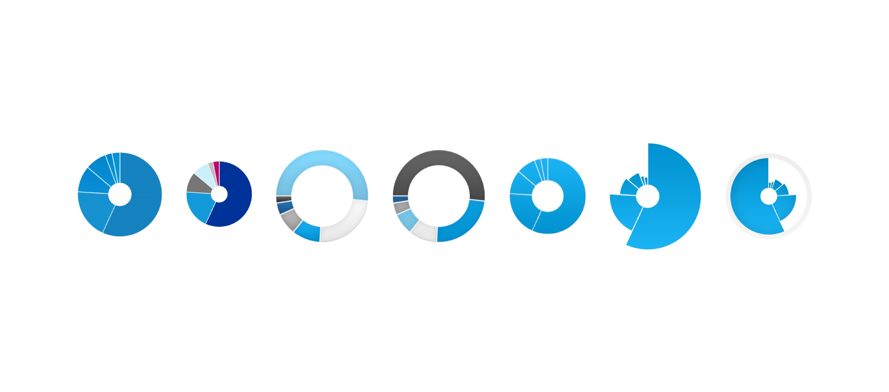
Once a direction was established UI patterns and pages were designed. Data visualisation was explored with the goal of creating engaging but easily readable information.


British Gas
Site Redesign
Information design
UI
Visual concepts
British Gas wanted a complete redesign of their consumer site. I was brought in to help with initial visual concepts as well as continuing the chosen design route. Working closely with the UX team I designed pages, elements and data visualisations.
Distinct visual directions were established early on to present to the client.
